D-a-M Identity
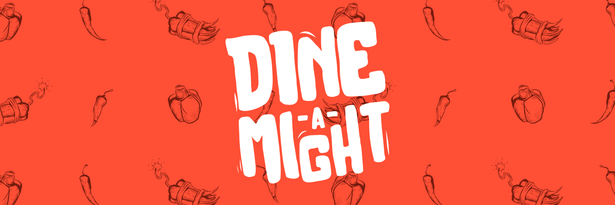
Dine-a-Might
A Chicago based battlefield-themed burger chain built by twin veteran founders who turned their military precision and hunger for chaos into a unique dining experience.
- Industry
- Food & Beverage
- Role
- Brand IdentityVisual DirectionIllustrationPackaging Concepts
- Tools
- Adobe IllustratorAdobe PhotoshopFigmaProcreate
- Platform
- DigitalPrint

Overview
Dine-a-Might was a fun one. The idea started from a fictional backstory about two veteran brothers starting a battlefield-themed burger joint, and I saw it as a chance to build a brand that doesn’t take itself too seriously but still feels tight and well put together.
I wanted the identity to feel bold, fast, and a little chaotic, but not messy. Everything from the tone of voice to the illustrations and menu naming was designed to feel like part of the same universe. I leaned into a comic-inspired visual style, layered it with military cues, and made sure it could scale across packaging, social, and in-store moments without losing its energy.
The goal was to create something that felt fun and immersive while still being a brand you could roll out in the real world. Not just a visual style, but a system that can flex, grow, and still hold its personality wherever it shows up.

Step 1
Discover
Understanding the tone, audience, and opportunity:
- I started by building a moodboard that pulled from comic books, 90s action films, food trucks, military gear, and fast food nostalgia.
- I looked into how Chicago-based food brands express personality and where there was room to push harder visually.
- The fictional backstory gave me a lot of creative space, but I still wanted the design to feel believable. The big question I asked was: "If this was a real place, how would people remember it?"

Step 2
Define
Once the tone was clear, I defined the brand values:
Nostalgic: Rooted in the charm of 1950s diners, the visual language blends retro forms (chrome, checkers, signage) with digital-native humor and unexpected modern elements.
Loud: The brand embraces strong contrasts, oversized typography, and eye-popping graphics. Everything from the logo to the menu is designed to make a statement and spark curiosity.
Playful: Humor is part of the brand’s DNA. Whether it’s punny menu items or winking copy, Dine-a-Might doesn’t take itself too seriously. The tone stays friendly, confident, and a little rebellious.
These values helped guide every design decision that followed. They kept things from going too far or losing focus.
- Nostalgic
- Loud
- Playful
Step 3
Develop
Designing the brand system:
- Built a custom logotype that felt strong and slightly exaggerated, with edges that hinted at explosion and motion.
- Chose a palette based on military tones with flame and neon accents to create contrast.
- Used bold, readable type with tight spacing for that comic-panel density.
- Designed illustrations, menu concepts, and packaging that all fed back into the story.
- Created a flexible system that could work across digital, print, and physical space.




Step 4
Deliver
Final visuals and rollout concept:
- Delivered a full identity kit with logo variations, color specs, and type systems.
- Built mockups for digital menu boards, social templates, and comic-style packaging.
- Wrapped it all into a concept deck as if it were a real brand about to launch.


Conclusion
This project taught me how far a concept can carry a brand when it's built on solid design principles. I had fun leaning into the chaos, but also learned how to keep it all balanced. The process helped me sharpen how I use storytelling to guide identity work, especially when it's meant to feel loud and story-driven.

